Creating Compass Wrapped!
Introduction
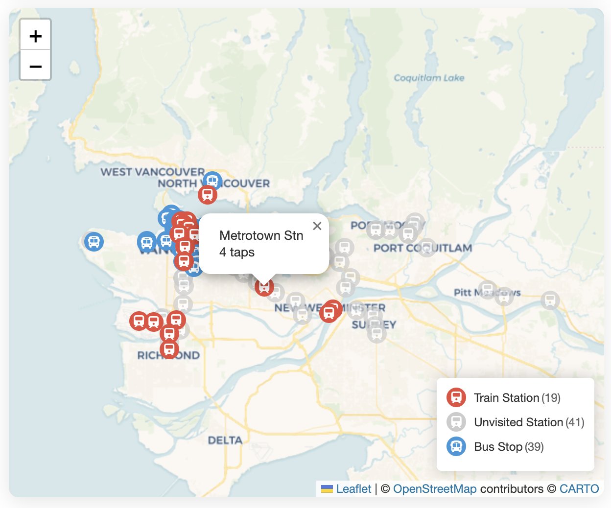
Compass Card Wrapped visualises your TransLink transit usage on a map. If you’re in Metro Vancouver and curious about your transit habits over the years, try it out! https://kevindeyoungster.com/projects/compass-wrapped
Backstory
It all started after I wrote a blog post about an unusual night encounter on the SkyTrain. That random observation got me thinking about habits and what we do as second nature without realising it.
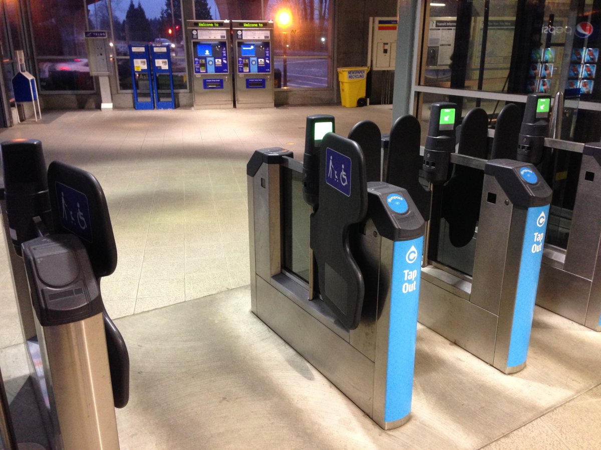
One such habit was how I tapped my Compass card. At Commercial Station, a friend once pointed out, “You have a weird way of tapping your card”. Apparently, I reach ahead of the gates, place my card on the reader1, and glide through in one fluid motion. This mini choreography popped up unconsciously. How many times had I tapped to develop this muscle memory?
This question led me to ‘compasscard.ca’ where I discovered you could export your transit history as CSV files. The data nerd couldn’t resist importing these files into a Python notebook!
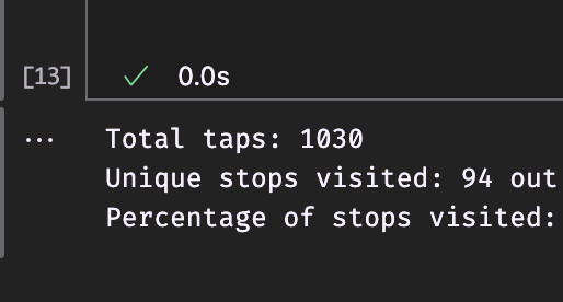
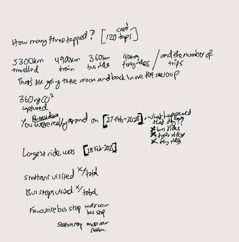
I was surprised—but also not really—to find I’d tapped over a thousand times in just two years.
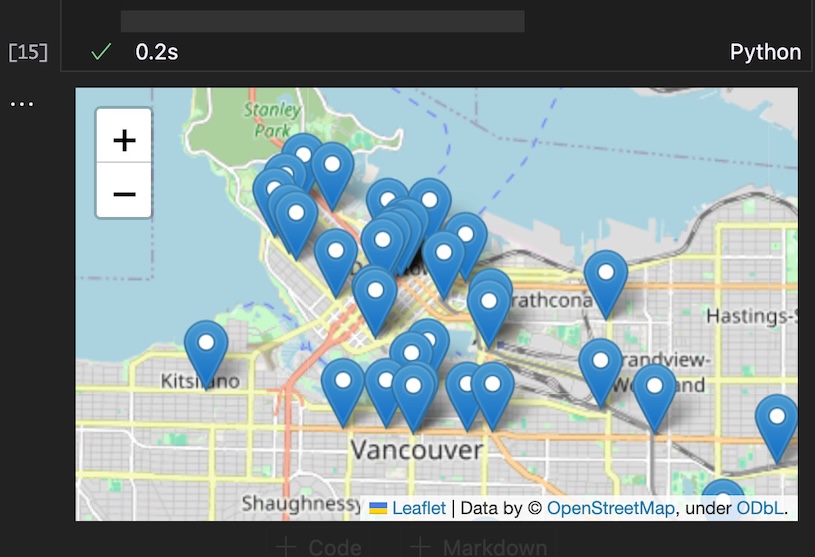
From there, I got more excited and asked other questions about the CSVs. They contained rich information: timestamps, journey IDs, and descriptions of where I tapped my card. Visualising this data on a map revealed patterns I hadn’t noticed about my movements in Metro Vancouver.
The real “aha moment” hit me in the shower. “Wait…wrapped!” Like Spotify’s Wrapped, but for transit. I rushed out of my bathroom and sketched a concept for a web app where anyone could visualise their transit patterns and habits.
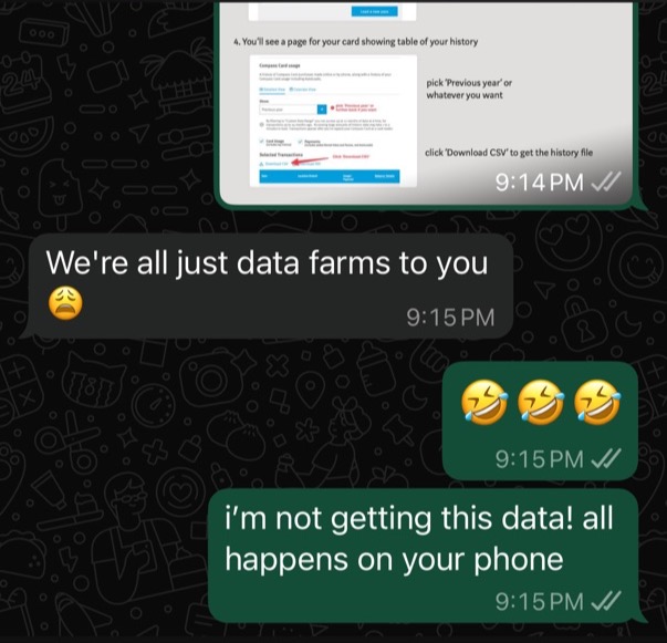
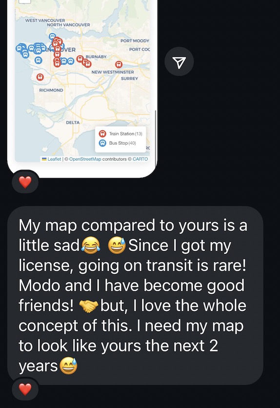
I converted my Python code to JavaScript2 and deployed a scrappy proof of concept for my friends to check out. Their reactions ran the gamut. I particularly loved this person’s comment.
After, I refined the app through a few more iterations to create what you see today: a simple web app that lets anyone explore their personal transit usage.
Technical
Under the hood, Compass Card Wrapped is a client-side web app (HTML, CSS, JavaScript) that processes transit history locally in the browser for privacy. When a person drops their exports into the app, here’s what happens:
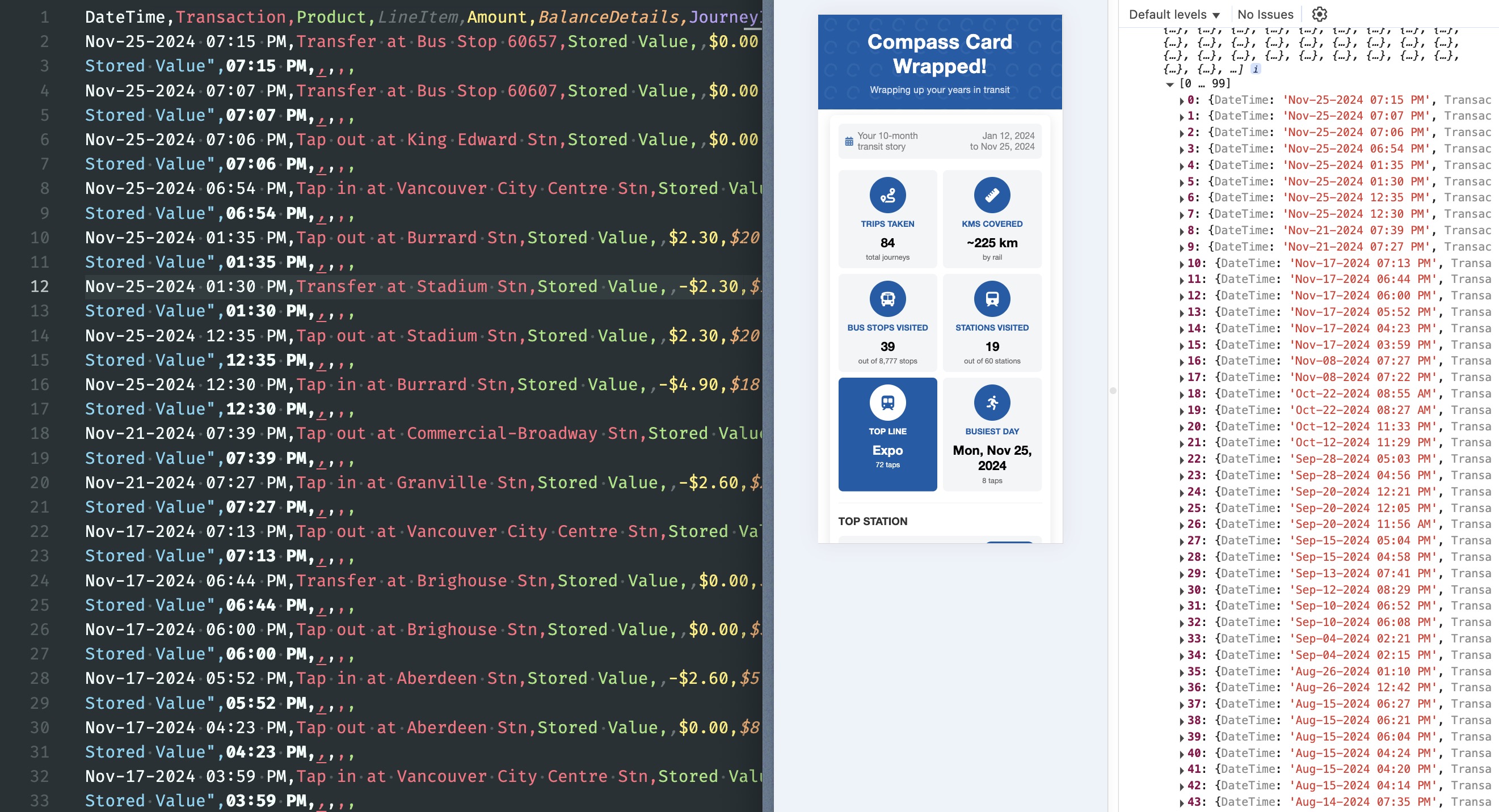
Step 1: Parse dropped CSV files
This app uses the
papaparse library to read the CSV
data, filtering for tap-related entries (keeping the “tap in/out/transfer at…”
while ignoring entries like “refund”, “loaded”, etc.)
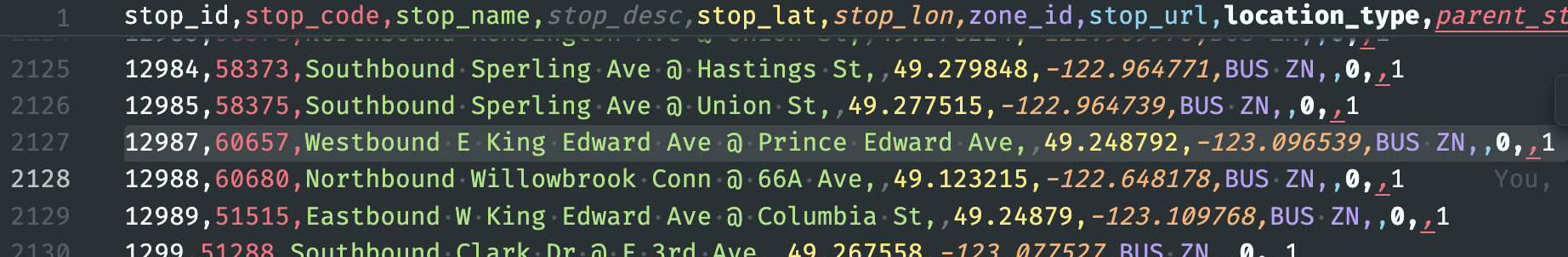
Step 2: Geocode the locations
The app needs to convert tap descriptions into map coordinates through a twohe-stage process:
| Description → | Stop → | GPS coordinates |
|---|---|---|
| “Tap in at Burrard Stn” | “Burrard Station” | (49.285833, -123.119557) |
| “Transfer at Bus Stop 60657” | “Bus Stop 60657” | (49.248792, -123.096539) |
Normalising descriptions to stop name/code
I extract location information from descriptions using pattern matching. While bus stop codes (‘Bus Stop <stop code>’) are straightforward, station names require an extra step because TransLink often abbreviates them on fare gates (e.g. “Marine Drive Stn” ‘Marine Drive Station’, ‘Main Street Stn’ ‘Main Street-Science World Station’ or my favourite: “Moody Center Stn” “Moody Centre Station”)
Since there’s no mapping between shortened and full station names, I created one that I updated organically as users encountered ‘new’ stations.
Converting stop names/codes to coordinates
This is where GTFS (General Transit Feed
Specification) data comes in. TransLink
publishes
theirs periodically, containing information about every stop in their system
for set periods. After normalising stop names and codes, I match them against
the stops.txt file in the GTFS dataset to retrieve latitude and longitude
coordinates. After geocoding, we can do cool stuff like calculating distances
and displaying markers on a web map.
What about discontinued stops?
Things got a bit tricky while creating this project. Some folks’ wrapped threw up pop-ups mentioning locations that couldn’t be geocoded (i.e. details not found in the GTFS dataset I downloaded). For stations, it was a matter of updating the mapping used to normalise. But for bus stop codes I was stumped.
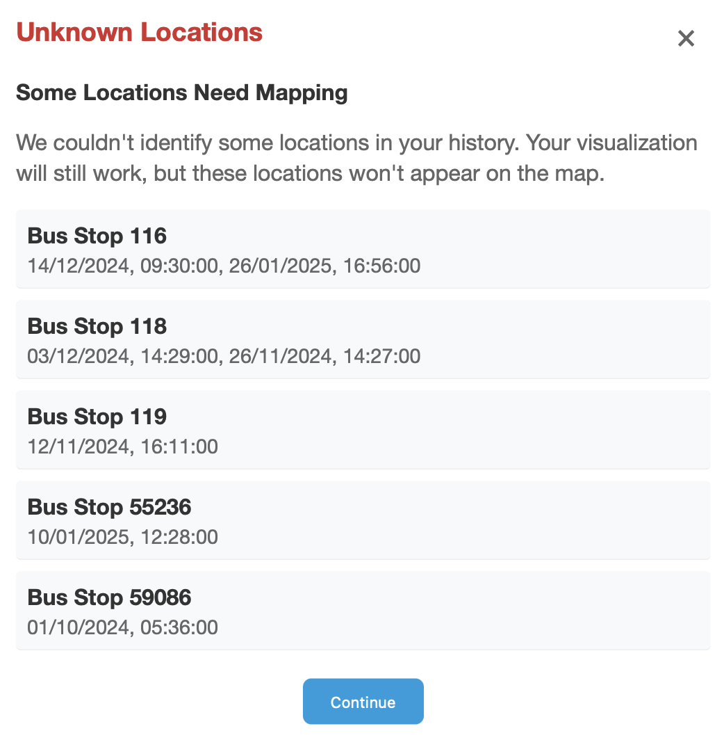
I searched stops.txt in the dataset but found nothing. That’s when I discovered that TransLink changes some bus stops over time (some are discontinued, some are moved). This was a case I hadn’t even considered!
To match coordinates for discontinued bus stops, like 55236, I needed to get older datasets from years before that might have it. Initially, whenever someone got the ‘unknown locations’ pop up, I’d ask for which codes they saw and manually add them to the dataset powering the app.
Eventually, I needed a more sustainable approach and created a little plug-and-play index. Now, as the app geocodes a stop, if it doesn’t find it in the current stops dataset, it uses an inverted index to figure out which dataset contains the stop, fetches that dataset, and caches it for other stops. Problem solved!
Step 3: Generate statistics
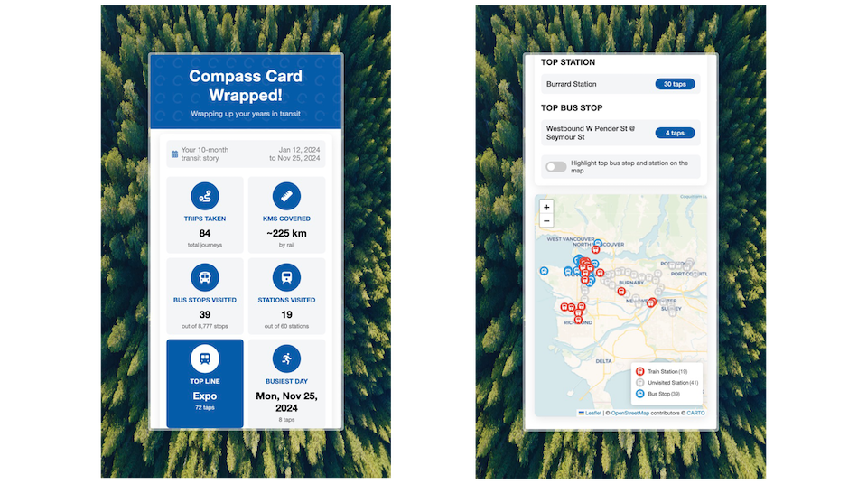
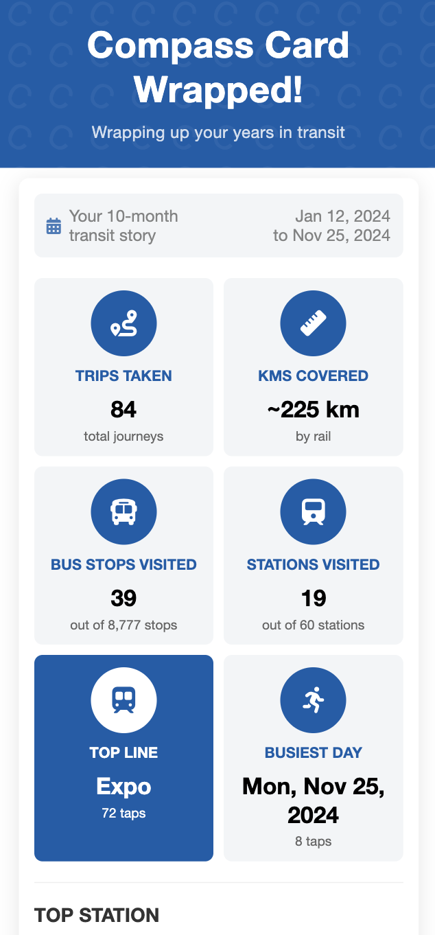
With all data processed, the app calculates:
-
Trips taken: TransLink groups history entries into separate trips
(indicated by
journeyID). Count uniquejourneyIDs to determine the number of trips - KMs covered: Sum up the distance between the first and last tap of each journey
- Bus stops & stations visited: Count unique bus stops and stations tapped at
- Busiest day: Group entries by date and pick the date with the most entries
- Top line: While processing stations, track which SkyTrain line each belongs to, incrementing counters to find the most used line
- Top station & bus stop: Count taps for each location to identify favourites
Step 4: Visualise the data
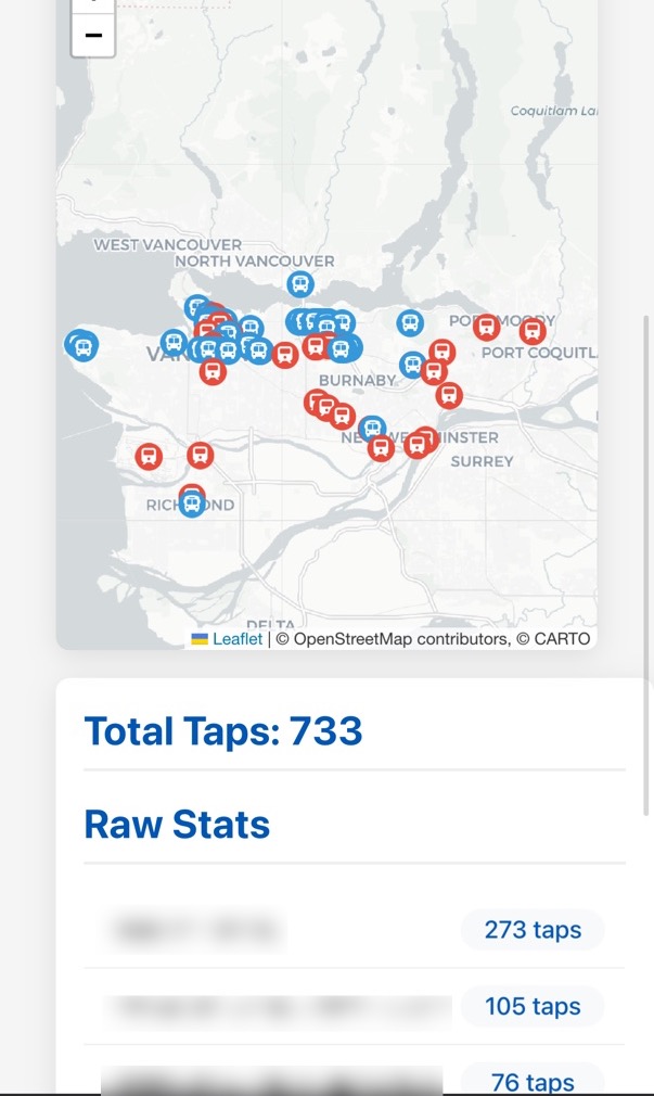
Finally, the app plots visited locations on a Leaflet map and displays statistics in a grid of tiles themed based on the user’s most-used SkyTrain line.
Reception
has been positive! People loved seeing their transit habits visualised, and some have even mentioned it motivated them to use transit more. In the two weeks since its release, the site has had at least 500 visitors!
What makes “wrapped” experiences so compelling (whether Spotify’s or this one) is that they serve as mirrors reflecting aspects of ourselves. We’re naturally drawn to these reflections—whether in the form of personality tests, music summaries, or whatever—because they help us understand our patterns and behaviours.
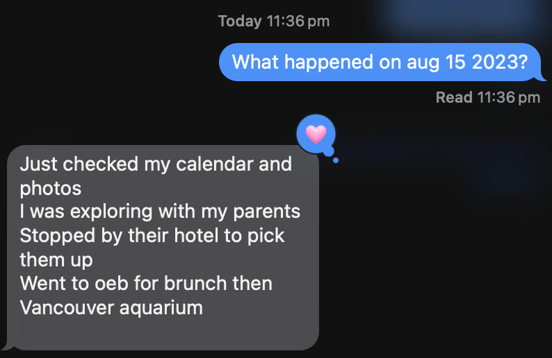
Compass Card Wrapped shows people transit habits they wouldn’t normally examine. The ‘busiest day’ tile I added particularly encourages introspection. For me, that day was May 28, 2024, when my cousin visited Vancouver and we spent our final day together exploring the city before saying goodbye.

I’ve loved seeing others discover meaningful patterns in their data too. One user realised their busiest transit day coincided with their parents’ visit:
Future?
While Compass Card Wrapped started as a quick personal project—‘View Source’ on the website and see the code for yourself—I think it’s got good promise:
Make it official!
The biggest step would be TransLink picking up this concept. Perhaps at “compasscard.ca/wrapped” so folks can log in and check their stats without manually exporting their history CSVs. With access to everyone’s data, TransLink could also add stats like:
- Percentile rankings: “You’ve visited more stations than 85% of Vancouver transit users”
- Environmental impact: “Your transit use saved ~420kg of CO₂ emissions”
Hey TransLink, if you’re reading this and want to make Compass Card Wrapped a thing, I’d love to help!
Enhanced Visuals
A future version could generate shareable score cards with visual illustrations based on usage patterns, something that would both delight folks and promote transit awareness on socials, like Metro Rewind.
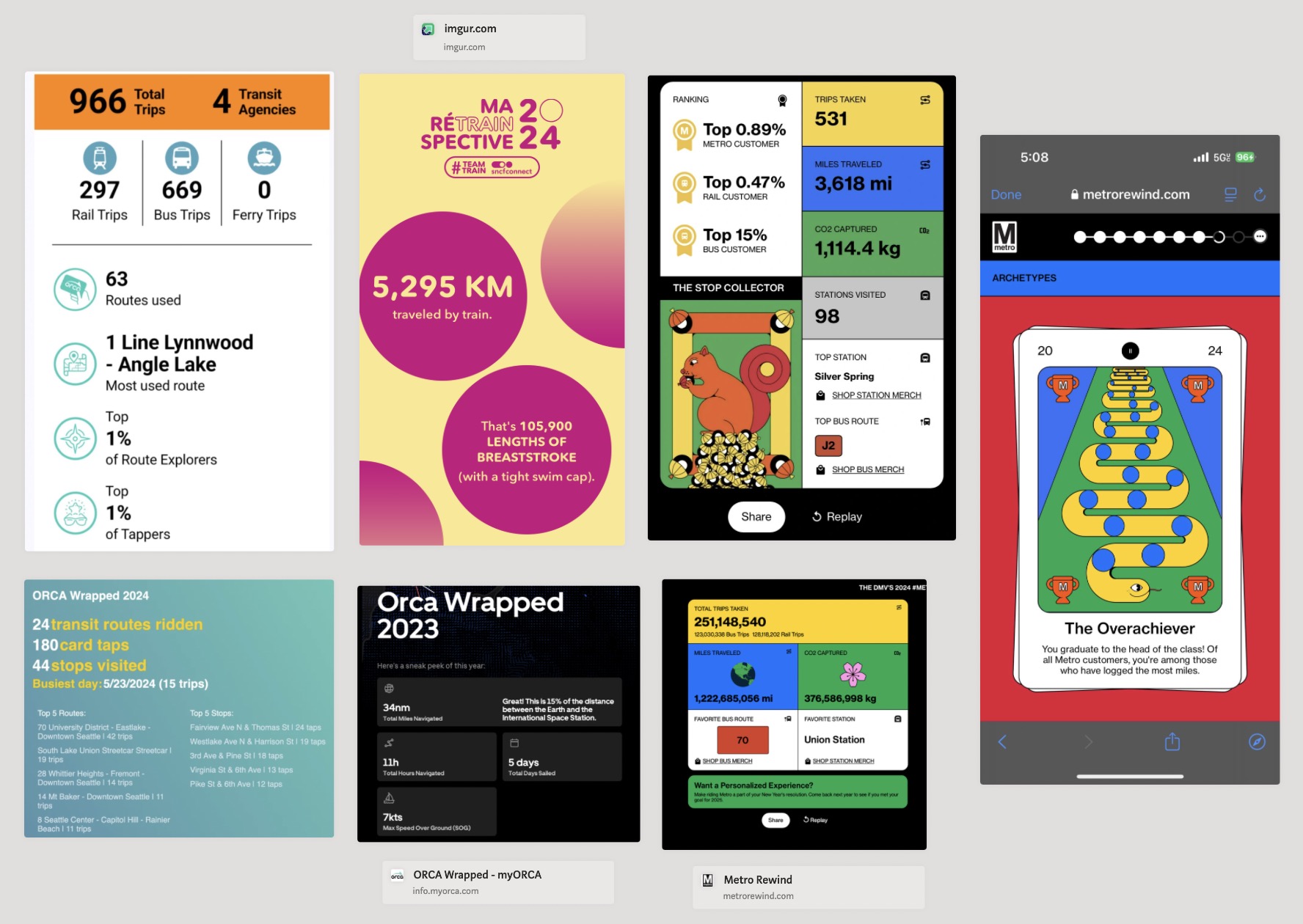
Adding ‘transit personas’ (illustrated by local artists, of course) would give people a fun way to understand their habits. Someone might discover they’re a ‘Downtown Diva’ who rarely ventures outside the city centre, an ‘Early bird’ who mostly moves around in the mornings, or an ‘Explorer’ who’s covered impressive ground across Metro Vancouver transit network3, so many possibilities! (done by a local artist, of course).
Technical Improvements
Improve distance calculations for multi-modal journeys to give users a more accurate picture of their actual transit footprint, especially those who switch between West Coast Express, SkyTrain and SeaBus. For this, whoever’s doing this might have to create a graph (state machine) of the station network.
Support for older historical data to match old discontinued stops. Currently, I’ve set the app up with GTFS data back to 2023. Anything before might result in the ‘unknown locations’ pop up when the app tries geocoding. Might be worth figuring out the minimum number of datasets to cover the most amount of stops. Again, this won’t be a problem if TransLink implements a Wrapped themselves 😇.
Conclusion
Creating Compass Card Wrapped taught me a lot about transit data while letting me build something people enjoy using. The enthusiastic reactions mean it could motivate people to use transit more!
Vancouver’s transit system impressed me when I moved here, and I hope projects like this encourage more people to explore it. While I’m focusing on other projects now, I’d love to see TransLink adopt this idea—they could make something more comprehensive with their complete dataset!
Want to check out your transit patterns? Give it a try and see what you discover. Got questions or want to chat about the project? Find me on Bluesky.